Redesigning the Kyros Provider Portal
The Kyros Provider Portal serves as a critical tool for Certified Peer Recovery Specialists (CPRS), facilitating appointment management, client interaction, and collaboration. Recognizing the importance of optimizing this platform for user satisfaction and efficiency, Kyros embarked on a redesign journey. The project aimed to identify pain points within the existing portal, uncover opportunities for improvement, understand user behavior, and produce new designs based on findings. Through feedback collection, competitive audits, sketches, usability testing, and iteration, the redesigned portal introduced new features and enhancements to address user needs effectively. This case study explores the process, observations, proposed solutions, and outcomes of the redesign effort.

Goals
-
Identify Pain Points
We aimed to identify and address pain points within the current state of the portal and in any new designs to enhance user satisfaction.
-
Uncover Opportunities
Through comprehensive research, we sought to uncover opportunities to improve the overall user experience, making interactions more intuitive and efficient.
-
Understand User Behavior
By delving into the behavior and preferences of Certified Peer Recovery Specialists (CPRS), we aimed to tailor the portal to their needs more effectively.
-
Produce New Designs
Based on our findings, we aimed to produce new and improved designs for the Kyros Provider Portal that would enhance usability and functionality.
🕵🏻♀️ Discovery
-

Feedback Collection
We began by gathering feedback on the current state of the portal from CPRS, asking about their experiences, pain points, and suggestions for improvement.
-

Competitive Audit
To gain insights into best practices and potential areas for improvement, we conducted a competitive audit, analyzing portals such as MyChart, Zocdoc, Cerebral, Kipu, and Procentive.
✏️ Early Designs
-

Sketches
Armed with insights from feedback and the competitive audit, we developed sketches and wireframes, iterating on design concepts to address identified pain points and incorporate new features.
-

Low Fidelity Wireframes
Armed with insights from feedback and the competitive audit, we developed sketches and wireframes, iterating on design concepts to address identified pain points and incorporate new features.
-

Usability Test Preparation
Armed with insights from feedback and the competitive audit, we developed sketches and wireframes, iterating on design concepts to address identified pain points and incorporate new features.
🖥️ Testing
New Features Introduced
-
Self-Serve Onboarding
Simplified onboarding process for CPRS, enhancing user autonomy and efficiency.
-
Consolidated Client Onboarding
Streamlined client onboarding into a single flow for CPRS, reducing complexity and improving user experience.
-
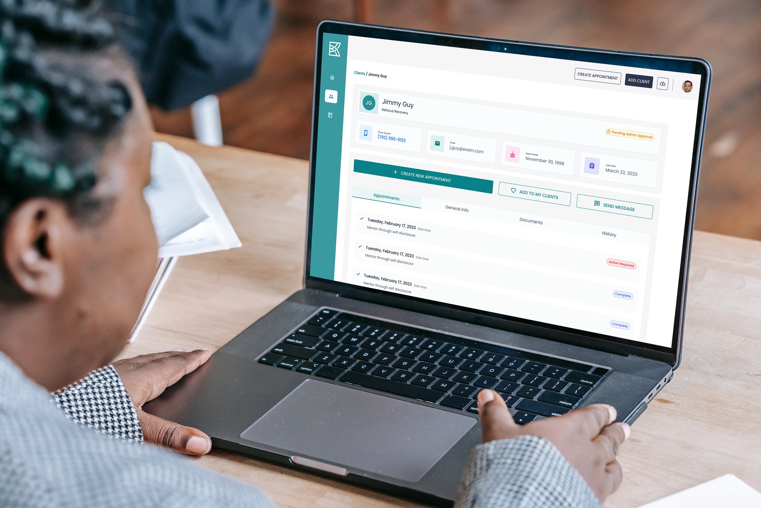
New Client Profile Page
New Client Profile Page: Revamped client profile page with enhanced visibility and organization of critical information.
-
New Appointments Page
New Appointments Page: Redesigned appointments page with improved functionality and user-friendly features.
Observations & Pain Points
-
Program Selection and Credential ID
Confusion and difficulty navigating the program selection and credential identification process.
-
Assessment Section
Users expressed confusion around the assessment section and suggested improvements to enhance clarity.
-
Client Profile Page
Users found the "date last seen" tile confusing and expressed a desire for clearer filtering options.
-
Appointments Page
Users requested the ability to filter appointments more intuitively and view only their own clients.


Proposed Solutions:
Client Page - Table View: Simplified status indicators and added a view for providers to see their specific client list.
Tool Tips for Provider Onboarding: Introduced tool tips and provided additional resources for program and credential steps.
Appointments Page Enhancements: Added a small calendar view, card view for appointments, and quick filters for easier navigation.
Client Profile Improvements: Enabled viewing of full client profiles from any portal page and organized client information into tabs for better organization.
Dashboard Updates: Enhanced the dashboard with banners, action items, upcoming appointments, and weekly hour summaries for improved visibility and navigation.
Navigation Enhancements: Updated side navigation with clearer language and symbols, made collapsible, and eliminated side panels for a full-page experience.
🎬 Conclusion
The redesign of the Kyros Provider Portal was driven by a commitment to enhancing the user experience for CPRS. By gathering feedback, conducting usability testing, and iterating on designs, we were able to identify pain points, introduce new features, and implement improvements that resulted in a more intuitive, efficient, and user-friendly portal. With a focus on user-centric design principles, the redesigned portal now better serves the needs of CPRS, empowering them to deliver quality care and support to their clients with confidence and ease.